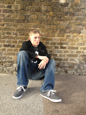
 I started to look at images that I could experiement with for the left side of the insert pane. We dicussed as a group that it would be good to have a photograph taken of him where he was sitting by himself to represent his sadness. I took this image on my phone while we were filming the music video. I thought it would be good to experiement with this photograph.
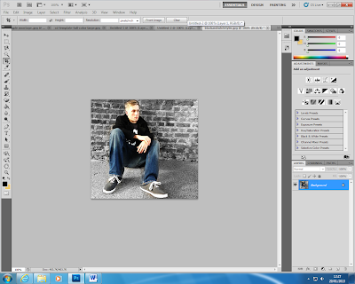
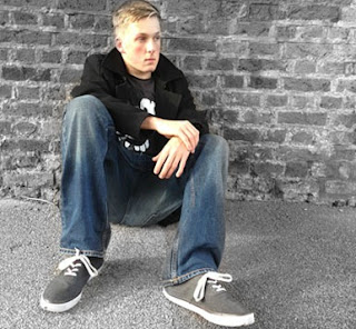
  Sayed brought an idea to the group of having Tyler in colour and the background in black and white which is quite a good idea, so I experiemented on photoshop came to this conclusion.
From cropping the image, I find that the wall plays a huge part in this photograph and works very well with the image. I changed the tone of the photograph, and this tone works better.
 I found the green tone didn't work too well with the left side insert. (Tyler sitting against the wall) So I decided to change the tone of the montage, to work with the photograph.


No comments:
Post a Comment