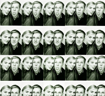
 We decided that for the inside of the CD cover, behind the CD, there should be a montage of Tyler and Charlotte which links to the music video, where they take images with the photobooth.
We all agreed it would be a good idea, and so I started to experiement with different tones and positions of the photographs.

This was my first draft, Sayed thought it would a good idea to cut the images up into pieces, since they are no longer together. This montage creates the atmosphere that they're still in love. But, we don't want them to have that atmosphere, because in the music video they broke up. I thought changing the image into a contrasty greenish tone, would give the image a great effect. I started to look at different tones I could experiement with, giving the photomontage a lovely atmosphere.
I really like the tone of this one, but the music video was about break up. So, we don't want to give the wrong atmosphere, so I think I'm going to stay with the green tone.
We then cut the photographs up, showing that they've broken up. The slit photographs is a symbol of their relationship. I think that the montage works better with the CD, than slitting it up. But it was good to experiement with.


No comments:
Post a Comment