Friday, 15 March 2013
Evaluation: Question 4!
http://prezi.com/jzl6bt7shrhr/untitled-prezi/?kw=view-jzl6bt7shrhr&rc=ref-34726331
Thursday, 14 March 2013
Tuesday, 5 February 2013
Survey.
There's a survey that I would appreciate if you filled out, honestly. This is will help with feedback and see what other's think about our products. If you have any other comments, please state them. Thanks for your time! http://www.surveymonkey.com/s/HFXJZQK
Also, if you haven't watched the music video yet, then there's the link. Check it out!
Music video: http://www.youtube.com/watch?v=tUvR3ft9TJU
Also, if you haven't watched the music video yet, then there's the link. Check it out!
Music video: http://www.youtube.com/watch?v=tUvR3ft9TJU
Monday, 4 February 2013
Change of plan!
I had problems with cropping the image of Tyler. Unforunately, the picture of Tyler went blurry once I had cropped. So I decided to change the image of the insert. I thought that this picture would be good to use, since it's the first scene where Tyler was waiting for Charlotte to come along.
It's a lovely photograph that reflects their relationship. A bench, of where he was waiting for her.
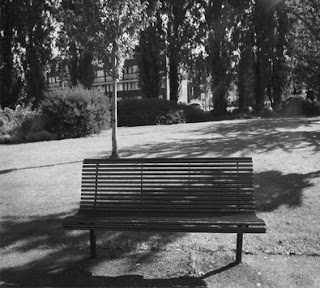 Sayed thought it would be a good idea to change the photograph, black and white. So I began to experiment with that.
 Thursday, 31 January 2013
CD development
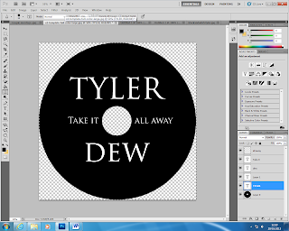
As a group we decided that the CD itself should be plain. I thought it would be good to have it black, and the writing white. The simple font links with our simple concept of the narrative/muic video. Giving a simple consistancy thoughtout.
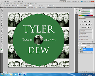 I started to experiement with different colours that I could use and may work with the CD. I changed the montage of Charlotte & Tyler, I added a huge contrast on the image and gave the image a green tone to it, making the green CD match with it. However, I found that the green CD didn't work as well as the black.The black has a professional and flawless look to it, compared to the green CD.
 Experiements and development for final products.
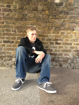 I started to look at images that I could experiement with for the left side of the insert pane. We dicussed as a group that it would be good to have a photograph taken of him where he was sitting by himself to represent his sadness. I took this image on my phone while we were filming the music video. I thought it would be good to experiement with this photograph.
 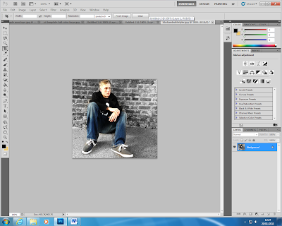 Sayed brought an idea to the group of having Tyler in colour and the background in black and white which is quite a good idea, so I experiemented on photoshop came to this conclusion.
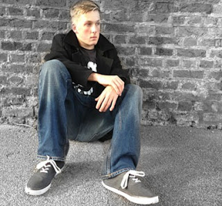
From cropping the image, I find that the wall plays a huge part in this photograph and works very well with the image. I changed the tone of the photograph, and this tone works better.
 I found the green tone didn't work too well with the left side insert. (Tyler sitting against the wall) So I decided to change the tone of the montage, to work with the photograph.
 Wednesday, 30 January 2013
Case studies- CD&Magazine.
Magazine advertsx2 from Yasmeen Melius
My case studies- I analysed CD covers, and magazine adverts in detail which helped with ideas for our own advert and CD covers. After doing these case studies as a group, we had a lot of ideas that we all came across and brought to the table. It was good to discuss what we believe would work for the final package, and what we could experiment with.
My case studies- I analysed CD covers, and magazine adverts in detail which helped with ideas for our own advert and CD covers. After doing these case studies as a group, we had a lot of ideas that we all came across and brought to the table. It was good to discuss what we believe would work for the final package, and what we could experiment with.
Monday, 28 January 2013
Plans.
Today we started planning our album cover; creating mock ups using photo shop. We have to create an advert for a magazine advertising our artist, and a CD cover. We started looking Ben Howard's album, Ellie Goulding, Lily Rose, Maverick Sabre and Plan B's adverts and album covers to get inspiration.
CD: For the front cover we decided that the photo shoot should be on location. We found an image of a male posing against the wall. We thought that this would be great to explore and experiment with.
CD: For the front cover we decided that the photo shoot should be on location. We found an image of a male posing against the wall. We thought that this would be great to explore and experiment with.
Saturday, 26 January 2013
Photoshop.

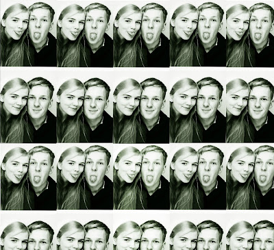 We decided that for the inside of the CD cover, behind the CD, there should be a montage of Tyler and Charlotte which links to the music video, where they take images with the photobooth.
We all agreed it would be a good idea, and so I started to experiement with different tones and positions of the photographs.

This was my first draft, Sayed thought it would a good idea to cut the images up into pieces, since they are no longer together. This montage creates the atmosphere that they're still in love. But, we don't want them to have that atmosphere, because in the music video they broke up. I thought changing the image into a contrasty greenish tone, would give the image a great effect. I started to look at different tones I could experiement with, giving the photomontage a lovely atmosphere.
I really like the tone of this one, but the music video was about break up. So, we don't want to give the wrong atmosphere, so I think I'm going to stay with the green tone.
We then cut the photographs up, showing that they've broken up. The slit photographs is a symbol of their relationship. I think that the montage works better with the CD, than slitting it up. But it was good to experiement with.
Thursday, 17 January 2013
Powerpoint Pitch.
We pitched our ideas to the class today, which was very helpful with feedback and ideas from our class mates. Here's our power point presentation that we showed the class of all our plans for the front cover, back cover and inside inserts. We found images on the internet that we thought would be good to use as inspiration and then take similar photographs for the final package.
Feedback: The class really liked our idea, especially the photo booth image for the CD back cover. I found this pitch very helpful to other people's perspective.
Also here's the video footage of us explaining our plans to the class, for our CD cover, back cover and inserts.
http://www.youtube.com/watch?v=oO-AS7kcofg&feature=youtu.be
Photoshoot.
Wednesday, 16 January 2013
Call Sheet.
Call Sheet
Date: Monday 14th January 2013
Date: Monday 14th January 2013
Time: 10.15am - 12.50pm
Assignment: Album photo-shoot (front
cover, insert 1&2)
Location: College studio and field (outdoor)
Client: Tyler Dew
Photographer
Yasmeen Melius : yasmeenmelius@gmail.com
Stephanie Wong: steph.wong@hotmail.co.uk
Sayed Ahmed: sayed-321@hotmail.co.uk
Make-up Artist: N/A
Hair Stylist: N/A
Wardrobe Stylist: Casual wear was asked to be worn, which connects with our music video.
Concept:
We need to use the main artist (Tyler Dew) for the photo shoot. We are going to do a combination of photos taken in a studio and on location. Because the song is about break up, and is on a sad subject, we want the actor to have an intense/sad facial expression. We plan to create a shallow depth of field image, having Tyler in focus and the background blurred.
We need to use the main artist (Tyler Dew) for the photo shoot. We are going to do a combination of photos taken in a studio and on location. Because the song is about break up, and is on a sad subject, we want the actor to have an intense/sad facial expression. We plan to create a shallow depth of field image, having Tyler in focus and the background blurred.
Timeline:
10:10:
Meet the group members, and prepare the photo shoot including the studio.
(Backdrop)
10:15:
Meet Tyler
10:20:
Outside location, took images using the walls, trees which corresponds to our
music video.
11:10:
Move to take images in the studio.
12:50:
Finished for lunch.
Subscribe to:
Comments (Atom)
 This is the final insert.


