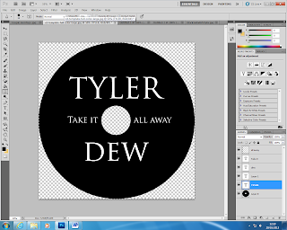
As a group we decided that the CD itself should be plain. I thought it would be good to have it black, and the writing white. The simple font links with our simple concept of the narrative/muic video. Giving a simple consistancy thoughtout.
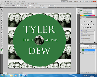
 I started to experiement with different colours that I could use and may work with the CD. I changed the montage of Charlotte & Tyler, I added a huge contrast on the image and gave the image a green tone to it, making the green CD match with it. However, I found that the green CD didn't work as well as the black.The black has a professional and flawless look to it, compared to the green CD.


